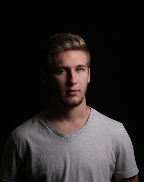
What a chaotic week filled with lots of glitter and cologne. Me and my classmates dressed to the nines in these past few days to take pictures in the studio of each other. It was good experience practicing what poses would work best for each pair that went up, and the individuals too. In real life, I can see how knowing how to conduct a formal shoot would be beneficial, since thats what they mostly are. Here are my favorites that I shot and edited. Some of these needed some level adjustments and even a mask to get those darker areas to show up.
This semester of my advanced photography class couldn’t possibly be summed up into five pictures. So much more happens behind camera than what gets captured. I can see now why so many people love photography – it’s the closest thing to freezing time. I’ve included five photos that I took this semester for assignments, but I wish I had five pictures that show how many fun memories I have of this class. I wish I took a picture of that time me and Anna laughed so hard we cried. I wish I took a picture of that moment when I realized how good of a human being Connor was. And if only I could have captured the many times Mr. Miller and I bantered at how I am the #1 PowerPoint creator. I met a lot of great people in the studio, and every person I interacted with helped develop my personality and character. Of course it is a strange feeling having to move on from high school and the only thing I have ever known, but it’s an even better feeling knowing that what lies ahead is many more memories and many more friends.
I am not sappy, okay?
I had some free time in Digital Media, so just shup up and enjoy the monologue. ^
I was disappointed at the limited galleries around town… and most of them are closed at the moment. So, I researched if there were any virtual galleries I could visit online instead. Thankfully, MOPA.org has a few online exhibitions that I thought were interesting.
Exhibition 1
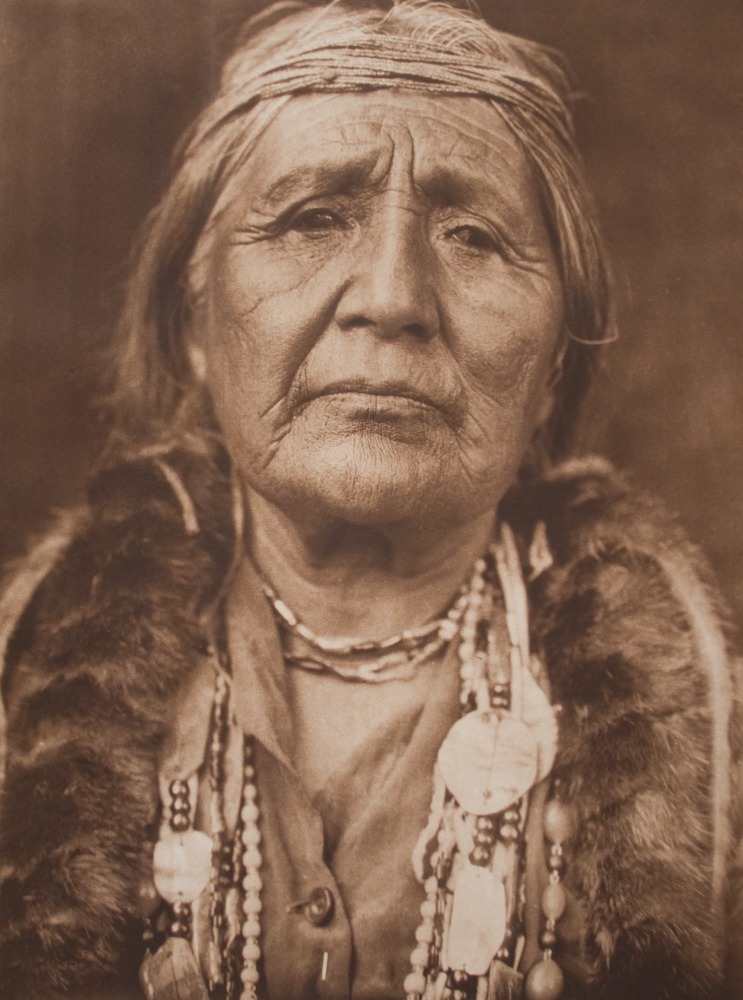
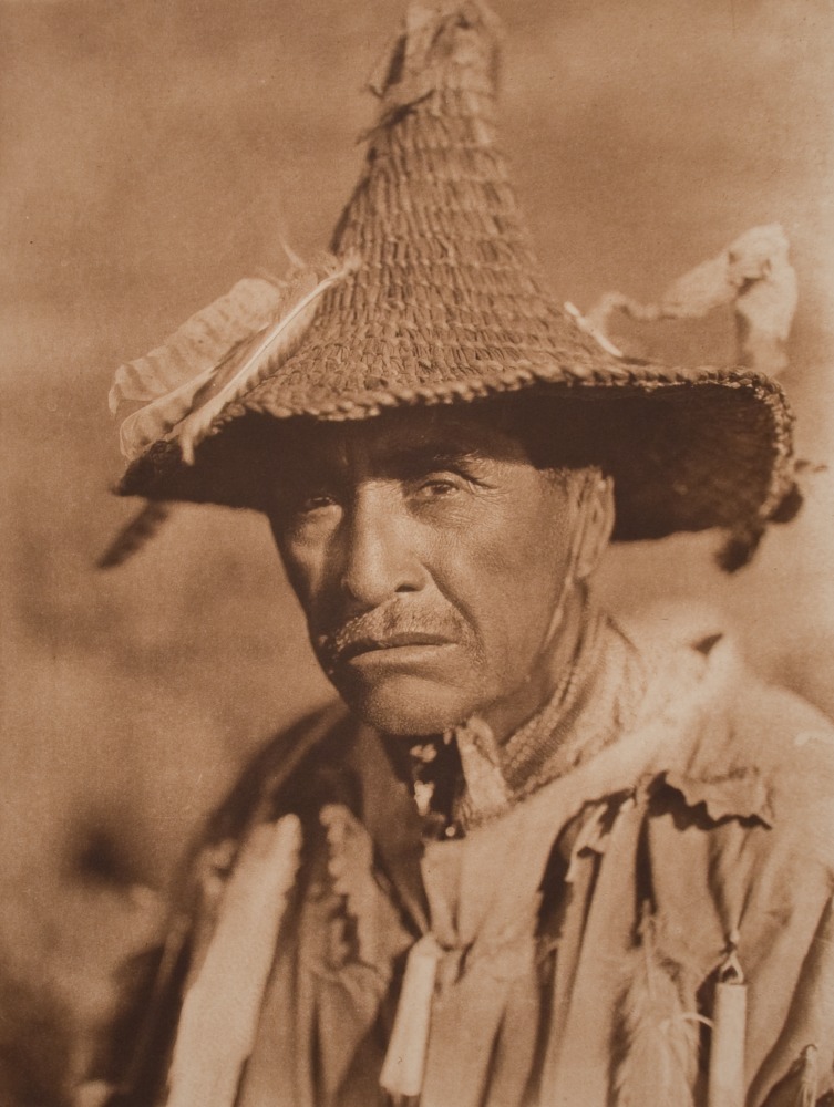
The first exhibition was titled “Facing the Past: Portraits by Edward S. Curtis” who was a popular American photographer from the 1900’s. His fame came from his documentation of Native American villages in 1906, called: The North American Indian. It was interesting to me to see his unique style still being used today, even with our modern cameras and technology. His photo’s took on a orange, rust hue over black and white. I remember editing a photo I took of some logs to look the exact same way, without knowing that the style dated back to the 1900’s. Here are some of my favs from this exhibition:
I love how he chose to take this picture close up. I feel like it brings so much more character to the subject.
I like the angle of this photo and the background. It blends in, but it adds depth.
Exhibition 2
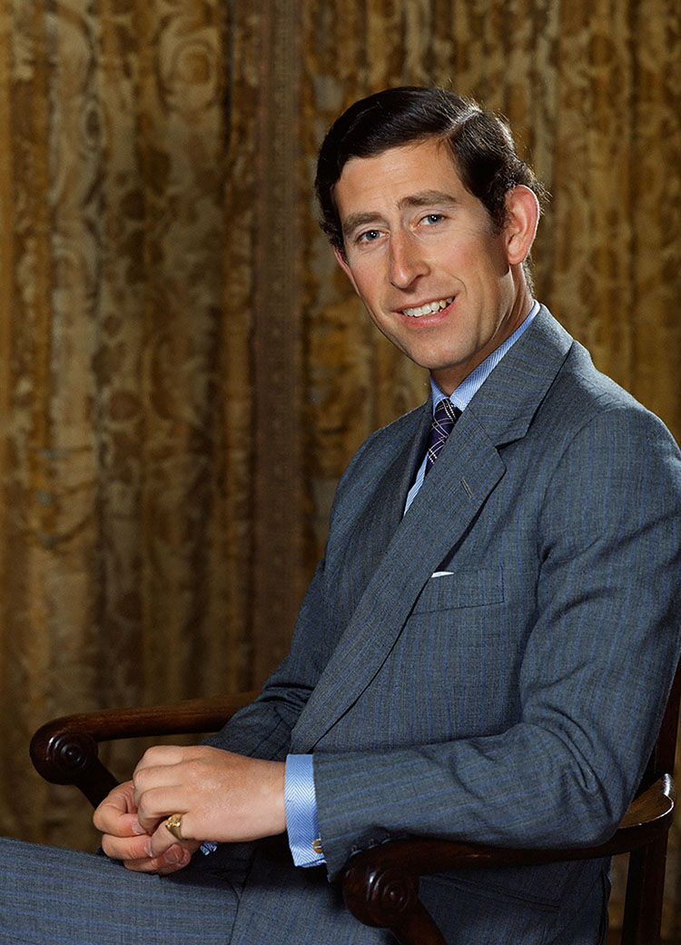
This was by far my favorite exhibition, which is why I am doing it last. This portion of the gallery is all under the label of Bern Schwartz, a famous photographer in the 1970’s, who primarily took photographs of significant public figures. His work was grainy and colorful – vibrant and washed out at the same time. MOPA.org says that his style was “intimate and informal” which I had to include because I totally agree. I would let him run my Instagram page if I could. I love love LOVE the vintage look that he shot with. It’s growing very popular right now. Here are some of my favorites:
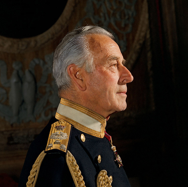
This is Charles. the Prince of Wales at the time. Intimate and informal is definitely the word I would use when looking at this. I can’t help but fall in love with this friendly looking guy, to be honest.
I love the lighting in this photo of Louis Mountbatten, and how his face and the gold on his vest stands out. Masterpiece.
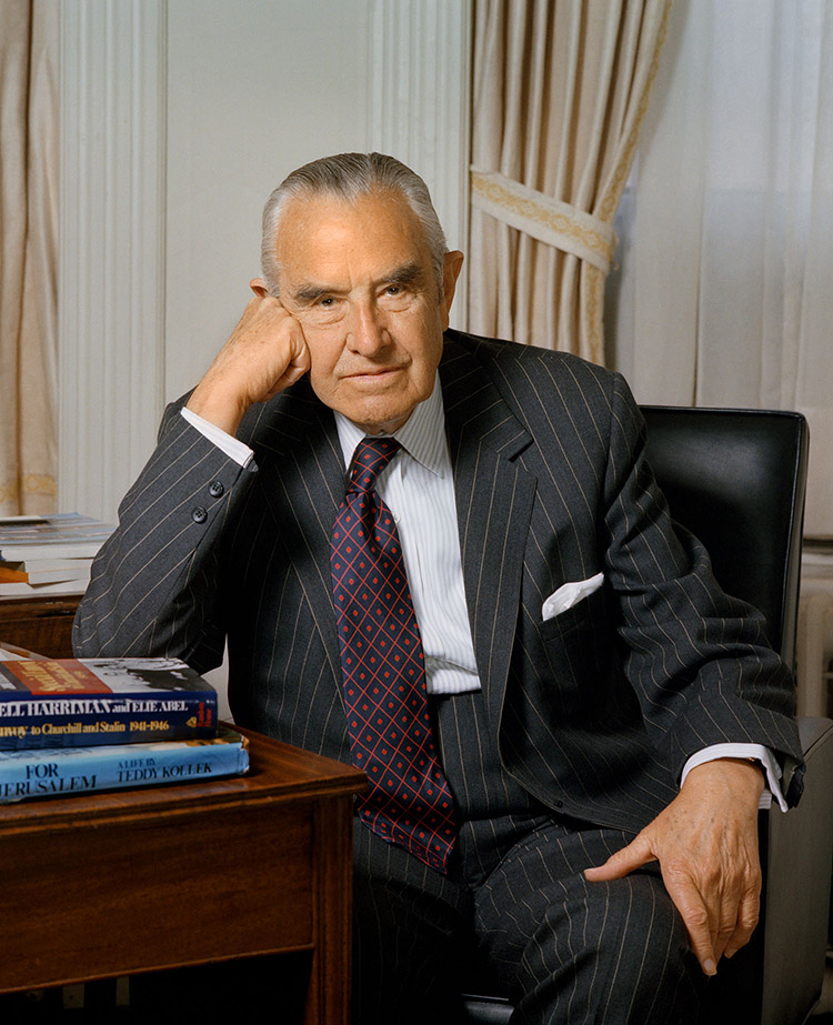
How can you not love W. Averell Harriman (whoever that is) after looking at this photo?? I would put this in the “environmental portrait” category because it shows a lot about the subject, and I can tell that props and other components have been strategically placed.
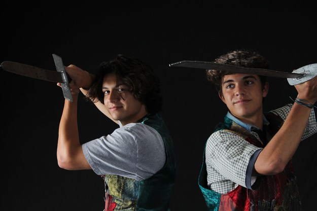
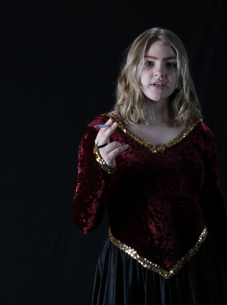
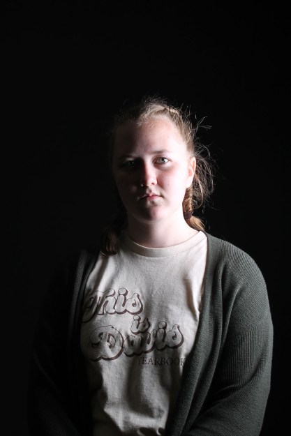
This was a fun week. My and my classmates dressed up and took pictures of each other looking all wacky. This was more of just a regular studio shoot, so nothing really new was learned. I liked seeing people i knew in a whole different light. I can see how this could be useful for new photographers. Okay here are the pictures.
For this project, I started out by downloading a plugin that would help me keep the lightsaber effect form throughout all the keyframes. I loved going through all the frames and matching the lightsaber to the sword I used. I got through that rather quickly, and then decided to keep the green background because it reminds me of a pirate.
I embedded this image through google drive, and it worked flawlessly. I am actually pretty proud of myself right now. Ignore the fact that my lightsaber hits me in the head and I somehow stay alive. That was, uh… an accident.
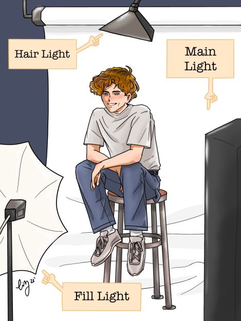
There are four basic lighting patterns that are used for different effects: Split, Rembrandt, Loop, and Butterfly lighting. Split lighting creates a very dramatic and mysterious glow to the subject. Rembrandt is a very common artistic lighting choice, and I often use it when I am drawing. Loop lighting creates an elongated shadow slightly angled under the nose, and Butterfly lighting has a more sharp shadow directly below the nose. I took a picture demonstrating these four types of lighting patterns to show as example.
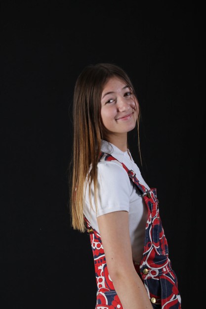
I learned all about studio lighting, and was tasked with creating a visual that shows the lighting I use in the studio, and also a photo I took in the studio using that lighting. Lighting, to me, may be the most important aspect of photography, because it can make or break a photo or add a flare that is unique to that photo.
For the visual, I admit that I went a little crazy. In this drawing, I including the Main Light, the Fill Light, and the Hair Light. I made sure to position my hunky model underneath the hair light, in the center of the lighting triangle.
For the photo I took, I just used a model in my class and took the picture with her underneath the hair light, and in the middle of the lighting triangle. She is so cute!
Before going and taking a stock photograph on my own, I needed to study an existing one to learn more about what makes a good stock photo. I chose a picture by Elia Pellegrini:
One reason this is a great stock photo is because it is very versatile. It could be used for an airline company, a traveling business company, advertisement for an event or a place, etc. I like the contrast, and the light on the woman’s face. I think one thing that I might want to fix is adding more negative space on the side, leaving room for a phrase or headline to be used on a website or brochure.
Now, for my own stock photo!
I chose a picture that would be versatile and easy to use as a background or main page picture on websites which specialize in culinary arts. Using my stock photo, creators would be able to add text on the napkin, their own links and words on the sides, or whatever message they want to portray. Here it is:
This project was free and easy. I enjoyed researching what aspects make a great black and white photo. Making photos black and white allows you to show the persons personality in the photo, and add depth and a more interesting focus. For my photo, I put my sister in a very bike-y atmosphere, implying to the viewer that my sister defines herself as a biker and nature lover. Black and White strips a photograph of its distracting pretty colors, leaving the only thing left – the focus. Here is my pic: