Photoshop disintegration activity

for this project, I took a picture of my mom and made her disintegrate. It was fun. Here is how it works:

First, I took the picture. Obvi. Before the huge editing process, i also made some lighting adjustments. Then I created two layers, one with an auto-aware fill to make the background plain. I used masks and inverted them. On one layer, I stretched out my mom further to the side. Using a new brush I downloaded and edited, I began creating splatters within the mask, uncovering that stretchy background underneath, therefore making it seem like my mom was disintegrating.

Camera Modes

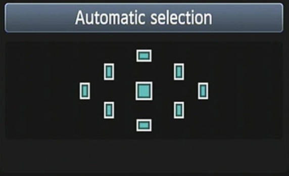
In my last post, I explained AF points and why I thought manual selection was better. Today, I will be sharing my opinion on why I think Manual mode is the better than Priority modes, in general.

First off, what is the difference between Aperture/Shutter Priority and Manual Mode? For dummies, a Priority mode auto-chooses your camera settings based on what you want your picture to look like, whether you want to focus on your Aperture (depth) or your Shutter Speed (motion). This is great and all, but when taking a unique photo that represents your own style, manual mode allows you to choose exactly how you want your photo to come out looking.

The one issue with Manual Mode is time. It takes time to make adjustments, and sometimes the perfect candid moment won’t wait for you to figure it out. In these cases, switching to a Priority mode can set your priorities straight, catching a moment before it disappears.

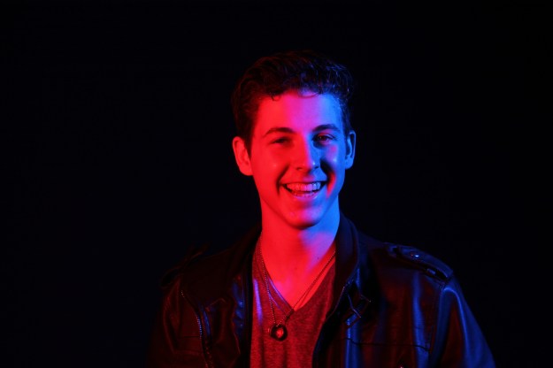
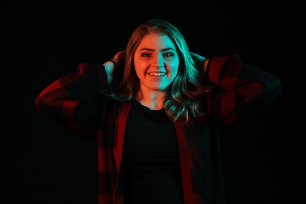
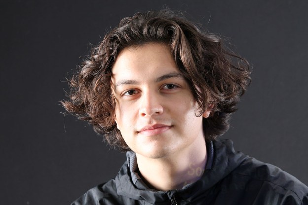
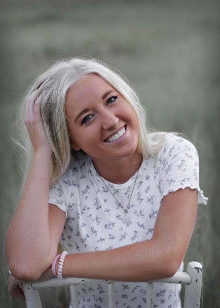
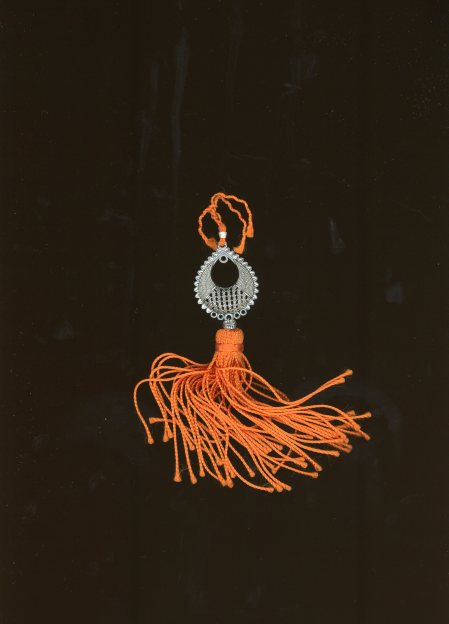
If you are just an average studio/still life photographer like me, Manual Mode is still the way to go. Here are a few photos I took, using manual mode.

I understand that studio portraits make it easier to use manual mode, because you are in full control of your subject. However, I like taking pictures of people anyway, so my opinion still stands.

thanks to https://www.creative-photographer.com/exposure-compensation-manual-mode/ for the lovely insights and great points.

My Camera’s AF Points

I did some research on my Canon Eos Rebel T3’s auto focus points.

If you are a rookie photographer and don’t like using manual mode, my canon has an automatic auto focus system to use. No button necessary. With the Automatic Selection, the camera will automatically focus on a specific subject in the frame, by looking at all nine autofocus points, and then determining which subject within is the closest. This is what it will look like in your menu:

However, sometimes you do not want your camera to focus on the closest thing, or maybe it is having a hard time focusing on anything. In most cases, it is a lot better to use a manual autofocus selection. In order to manually set the focus point, the camera must be in P, Tv, Av, or M mode. First off, to access your camera’s autofocus selection tool you must find it first!

After you find and click on the autofocus point selection button, your menu will pop up, looking like this:

From here, you can use the focus ring on the lens or the pad to navigate to which point you want to be in focus. And it’s as easy as that! Enjoy your focusing.

I got my information from https://www.dummies.com/photography/cameras/canon-camera/set-an-autofocus-point-on-a-canon-rebel-t3-series-camera/

GLITCH

for this project, i took a unique picture of a friend, and then opened it in notepad ++, where i then messed with the code until i found something i like. it took a while for anything cool to happen. for one, i had to use many different pictures until one actually looked better. i also had to work on this picture multiple times to add more glitch to it. overall i like it.

lol.

focal length

this project was so fun. i was lucky enough to do it in the studio, so it all turned out really nice. i used connor as my subject. for this assignment, i used focal lengths of 18, 24, 35, 55, 75, 135, 200, and 300 mm to see the difference it makes. i started close up and ended up very far away, just to keep the distance from connor the same. very trippy. i am happy with how this demonstration turned out.

Exposure triangle

to review what i have learned so far, i did a little photography review. i took 6 photos to cover what i have learned thus far. the first two are an example of different apertures: shallow depth of field and deep depth of field. The next show the difference between a low aperture(blurred motion) and a high aperture(frozen motion). finally, the last two photos have been taken with a low ISO and high ISO, respectively.

Shallow Depth of Field

Deep Depth of Field

Blurred Motion

Frozen Motion

Low ISO

High ISO

About me (2021 update)

Hi. I’m Lizzie Miller and this is my third “About me” blog post. A lot has changed though. Well, actually, not really.

I am a Senior at Davis High School, and I love having free time. My schedule is usually empty, because I like to plan my day more spontaneously, instead of having a laid out plan for every second of my life. I am taking photography because Anna Larsen is in it and we are tight. I am very hands-on creative, so this has been a challenge for me, using a camera instead of a pen. However, I do enjoy those moments when I am proud of something I have created in photography, so it is worth it.

My favorite food is Bacon Burgers and Fish and Chips, and my favorite hobby is digital art. I draw cartoons and they are neat. That is all.

I have spoken.

Scanner

For my last photography assignment in my current class this semester, I was able to bring an object to scan. I chose a souvenir that I got from Spain. Scanning is another type of photography, just without a camera! I did a scan with a white background and a black background, so I will show both. I think I like the white better.

HDR

For this assignment, I took 3 photos. One with a high exposure, one with a good exposure, and one with a low exposure. By merging all 3 photos and creating masks in photoshop, it allows me to adjust which areas I want a higher or lower exposure. I took a picture of clouds. I wanted the clouds to not be overexposed, the cityscape to be more exposed, and I left a few areas that had good exposure. It turned out all right, considering the fact that I did it on my mac, and I am still a noob.

Completed Image

Original Photos

Fashion Poster :0 jack

For this assignment, I used some interesting photos and patterns to create a design fit enough for a designer perfume bottle. Well, all except for the title. Anyway, First I inserted a picture of a girl and a girl’s profile. After changing the opacity and spicing it up, I added some paint splatters. I used some low-opacity boxes to spruce up the background. This assignment wasn’t fun. here it is

Design a site like this with WordPress.com
Get started