This animation took a pretty long time to complete. I had originally planned it to be 15 seconds, but with many laptop dysfunctions at home, I ended it at 10 seconds.
I loved drawing the hand opening the pizza pox the most. I think it was very fun getting the timing right and the flow of the opening. The cheese was the weirdest part, because it was a very odd substance. Keeping track of layers was the hardest part of this assignment, and overall I think Adobe Animate is a pretty stressful program to use for full length animations.
For this assignment, I took the Walk Cycle that I created of me and put it in its own environment, using motion tweens. The items in the front, such as the velvet rope and the lighter silhouette, move faster in parallax motion. The things in the back, like the darker silhouette and the cityscape, move slower in parallax motion. Working on this was very fun; I loved adding my walk cycle to such a fun background. If you ask me, my walk could pass as a catwalk.
This assignment was tedious but a very fun process. I started by recording myself walking, and then outlining it in Adobe Animate. After the outline, i filled it with color and shadows. I edited the walk so it went across the entire page, and the end product was great! This really does capture my walk, if i do say so myself.
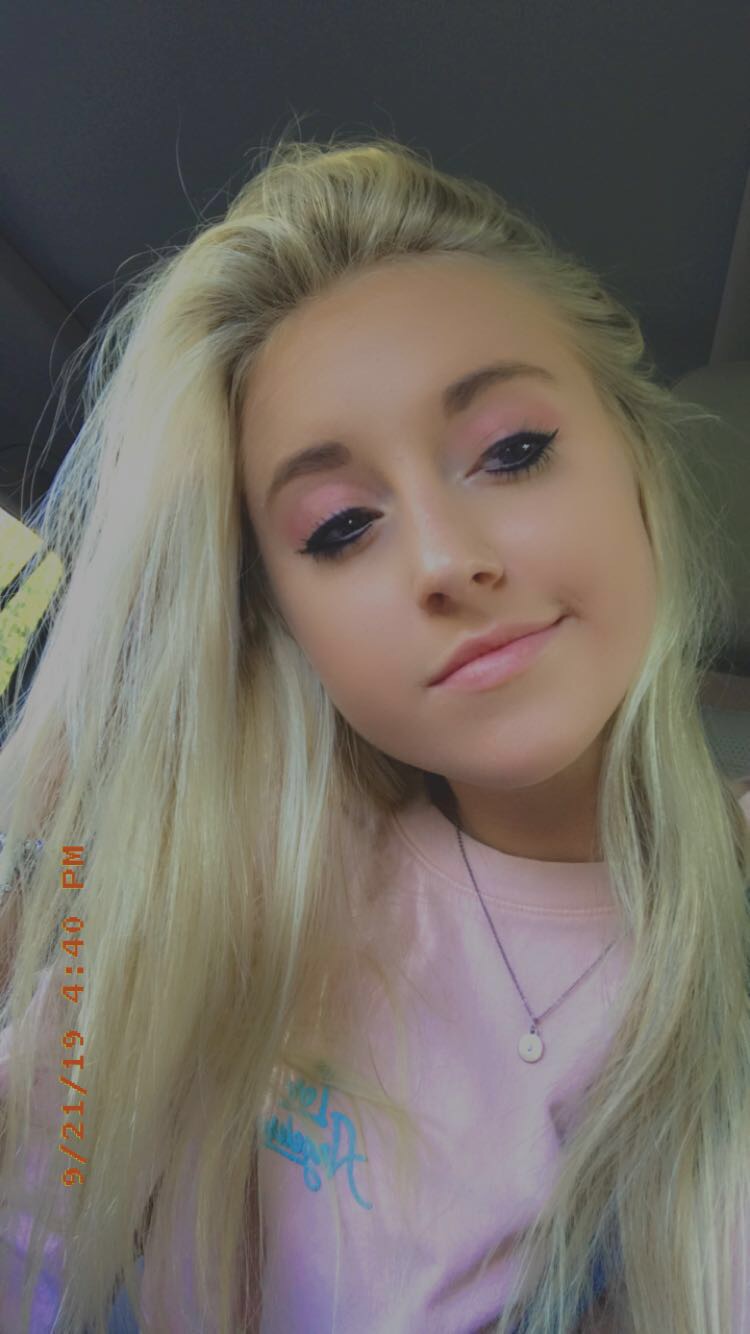
Yes, I, Lizzie Miller, re-created a Lizzie McGuire poster using myself. This was by far the funnest project I’ve done in an Adobe program thus far, and it turned out even better than I thought it would considering the fact that I didn’t even know Adobe InDesign existed beforehand.
The first thing on the agenda was getting my picture taken (which, thanks to my awesome Digital Media teacher, turned out a-m-a-z-i-n-g), and I definitely had the most fun pretending to be a model. I added the simple quotes and stand-alone words next since it seemed easy.
The hardest part was definitely the logo, since this whole project had to be done from scratch. I experimented on Adobe Illustrator for a very long time with fonts and style settings, and finally got the look I was searching for. After that, I consistently used those new settings for the rest of the text which helped get it done faster.
Seeing the final project now, I am proud of the work I put into this poster, and I will definitely enjoy doing things like this in the future.
The outer space assignment seemed pretty daunting at first. As a beginner in Photoshop, I thought it would be very difficult. However, once I got the hang of things, it was very fun! I started with the background, and created the stars and nebula. The stars were instantly made using a light noise filter. Then i added my own photographed textures to make the planets; the texture of the water in my pool, and the sand on the beach I went to this summer. I darkened it and shadowed it by adding a new layer above and blackening it out. The dust ring was the final step, and it was very easy to do. It took less than 5 minutes, and turned out great. I created it in a new document using the clouds filter, and adjusting the swirl to make it a ring-like shape. This was a challenging yet fun project to work on.
This assignment was very fun and fairly simple to me. I started out with an old photograph of a train, and turned it into a Polaroid picture coming to life. Many layers, styles, and masks took this assignment to the finish line. To begin, i had to create the basic rectangular shape of the printed picture, and then use layer masks to make the train stand by itself outside of the box. Then it took stylizing to make it really pop. I enjoyed this assignment a lot, and I think its one of my favorites.
Today I investigated 3 photography pointers: rule of thirds, leading lines, and depth of field. I chose photos from professionals online and also photos I have taken before, and analyzed them to see if they fit all of the requirements.
The first photo I found online is specifically all about the rule of thirds. The fox is placed in a perfect position, intersecting the lower right boxes. I also noticed that the foxes face leads the eyes to the unique background, that otherwise might not have been noticed. I found this photo at https://www.capturelandscapes.com/the-rule-of-thirds-explained/ , created by Christian Holberg.
The next photography tip I investigated was leading lines. This photo I found at https://camerajabber.com/compose-images-leading-lines/ , by Jeff Meyer, is perfect for that pointer. The lines on the road lead the eye right to the sunset, and the electric lines on the top also do a good job of that. The placement of the sun is right in the middle of all of the electric lines, making almost every silhouette in the picture a path to the focal point.
My final professional picture I found was centered on depth of field. This photo I found at https://onextrapixel.com/30-examples-of-shallow-depth-of-field-photography/ , by Yogesh Singh, focuses the entire picture on the leaf. The background, I assume, is a green leafy scene, but making the focus of the picture on the leaf creates another note of professionalism. The eye is immediately drawn to the leaf, and there’s no where else to look.
This photo was taken of me and my dad while we went zip lining in Hawaii. the horizon is in the top 3 boxes, and I am centered along the left vertical line, making an intersection with the bottom left boxes with my legs. My dad is near the right vertical line as well.
I took this photo during my trip to Spain with my dad this summer. The Castle’s courtyard and gardens have bushes that create lines leading to the center-point of the mansion. With the huge front rooms at the focus of the picture, the gardens bushes do a great job of leading the eye to it.
This photo of me was taken by my dad on our trip to Morocco this summer. the view of the mountains in the town we visited is blurred in the background, leaving me the focus of the picture. I also noticed that the slope of the mountains in the background create a path to my face, making it even easier for me to grab the attention in this picture.
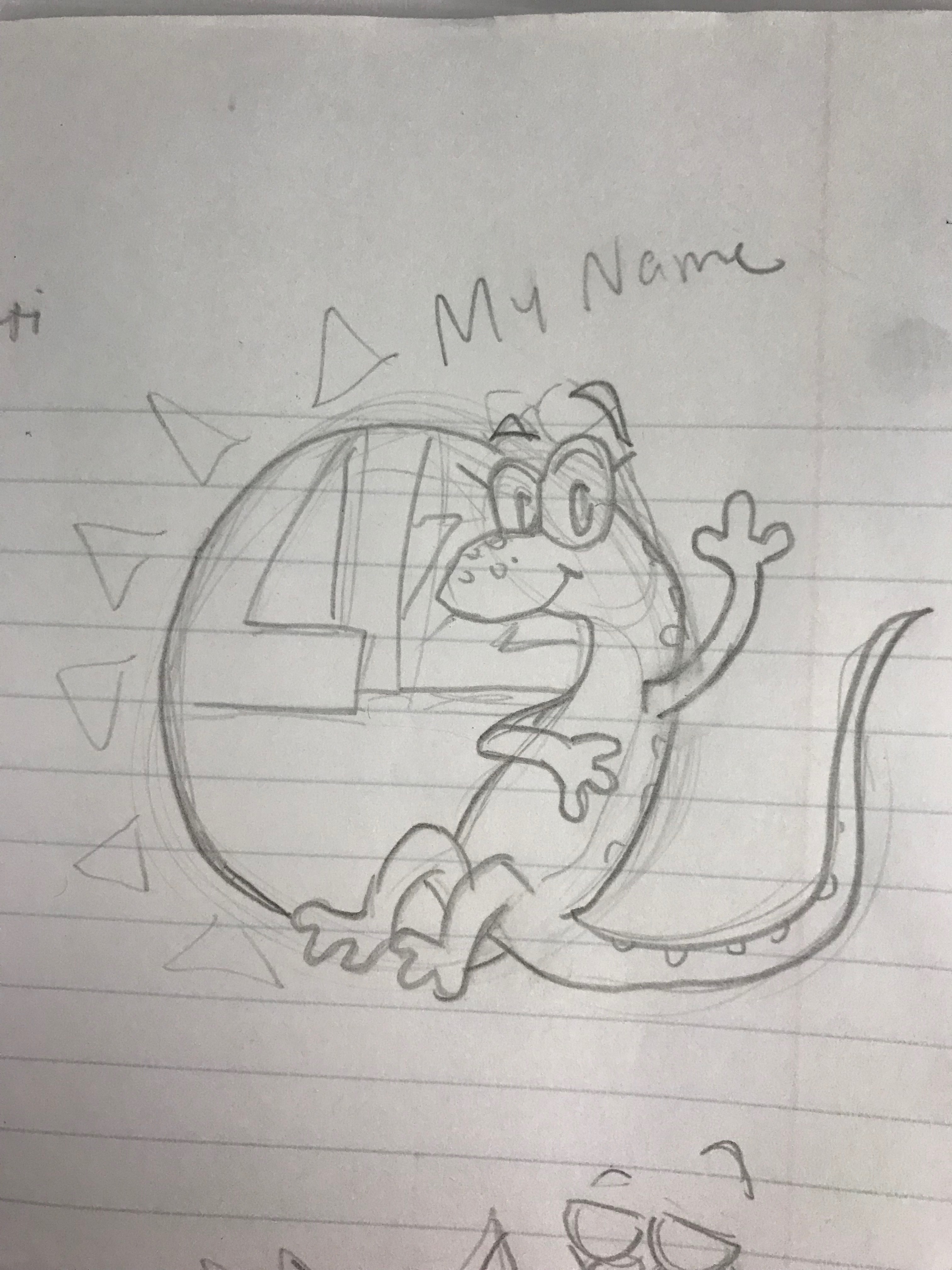
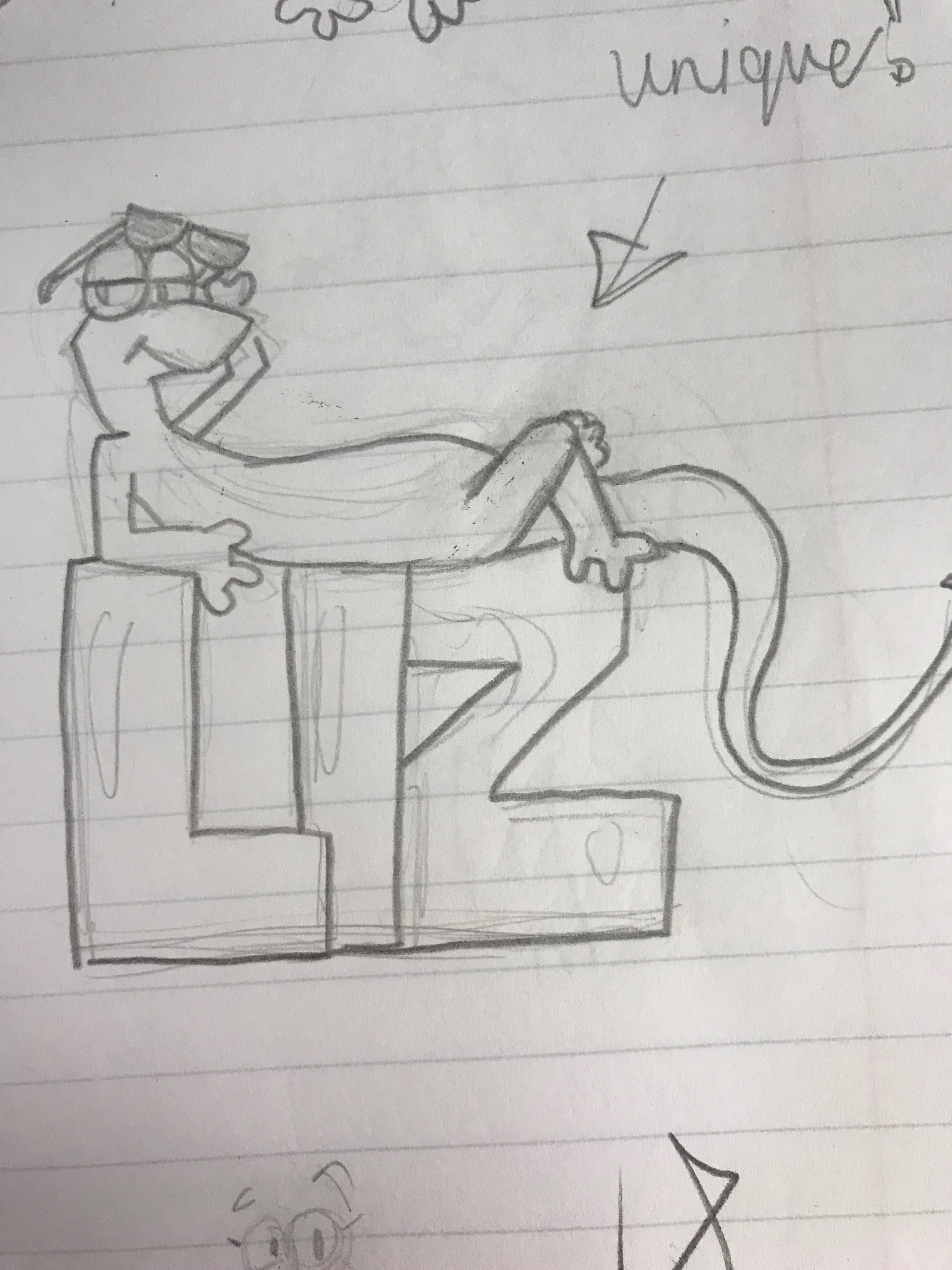
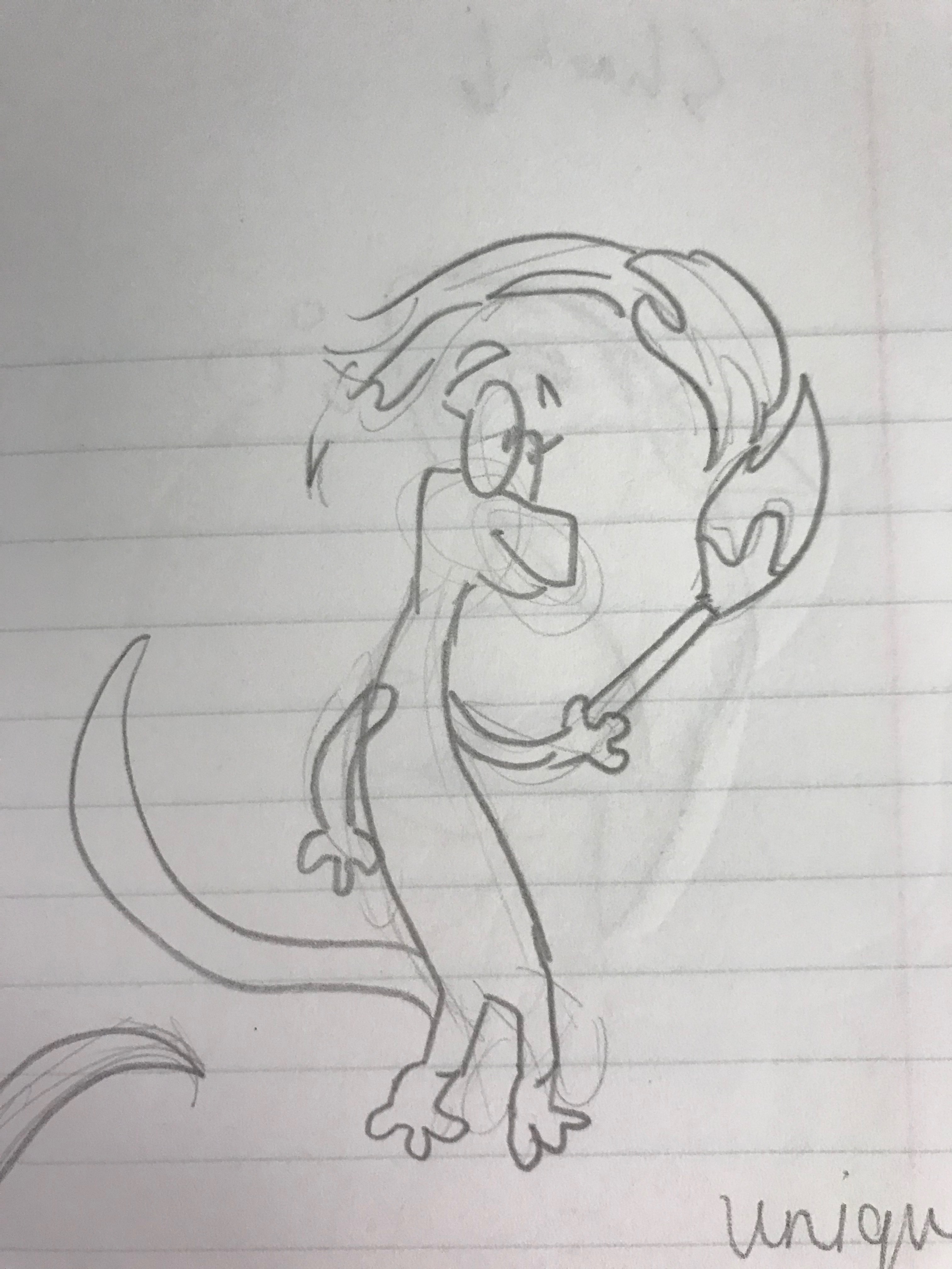
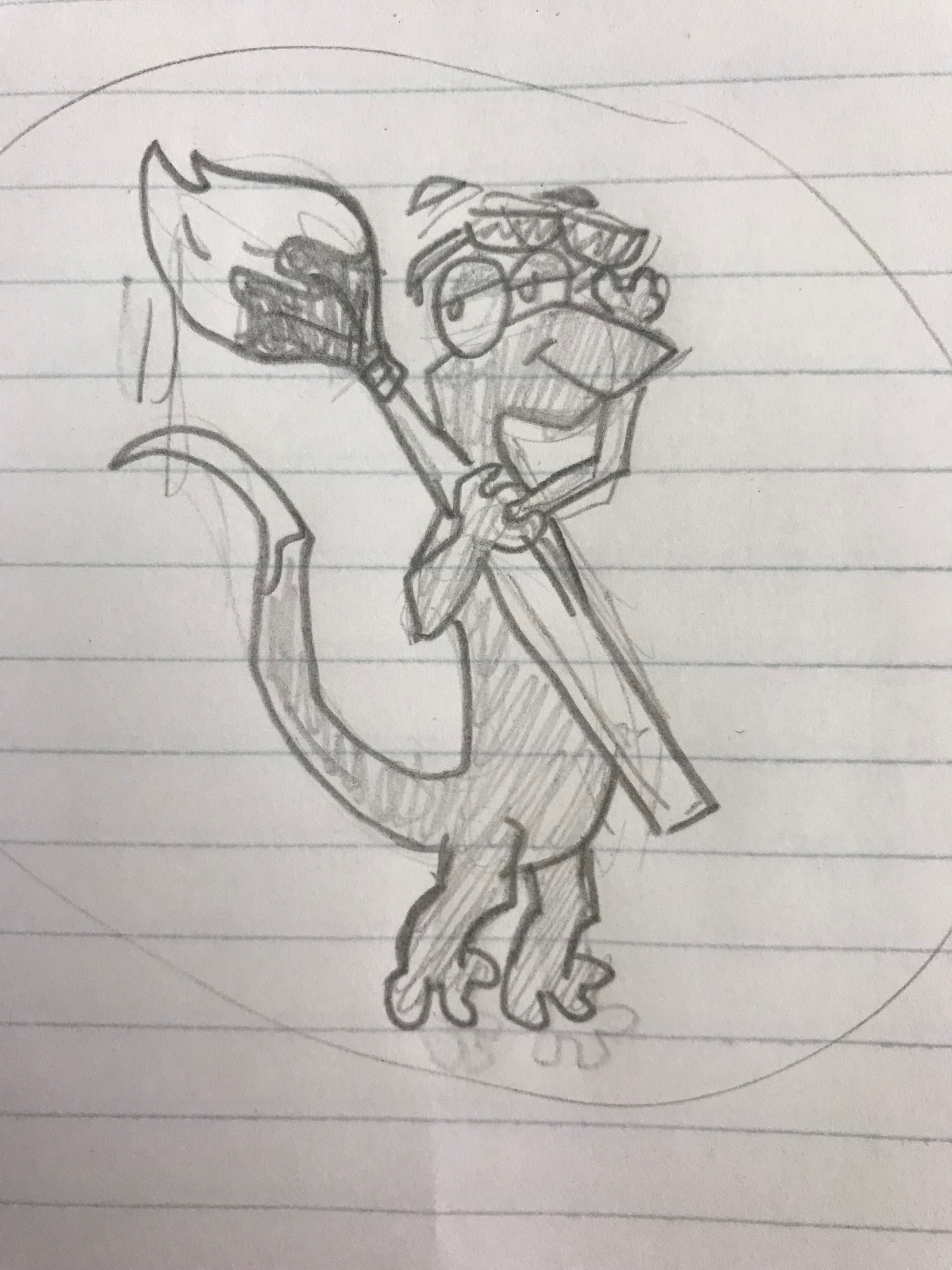
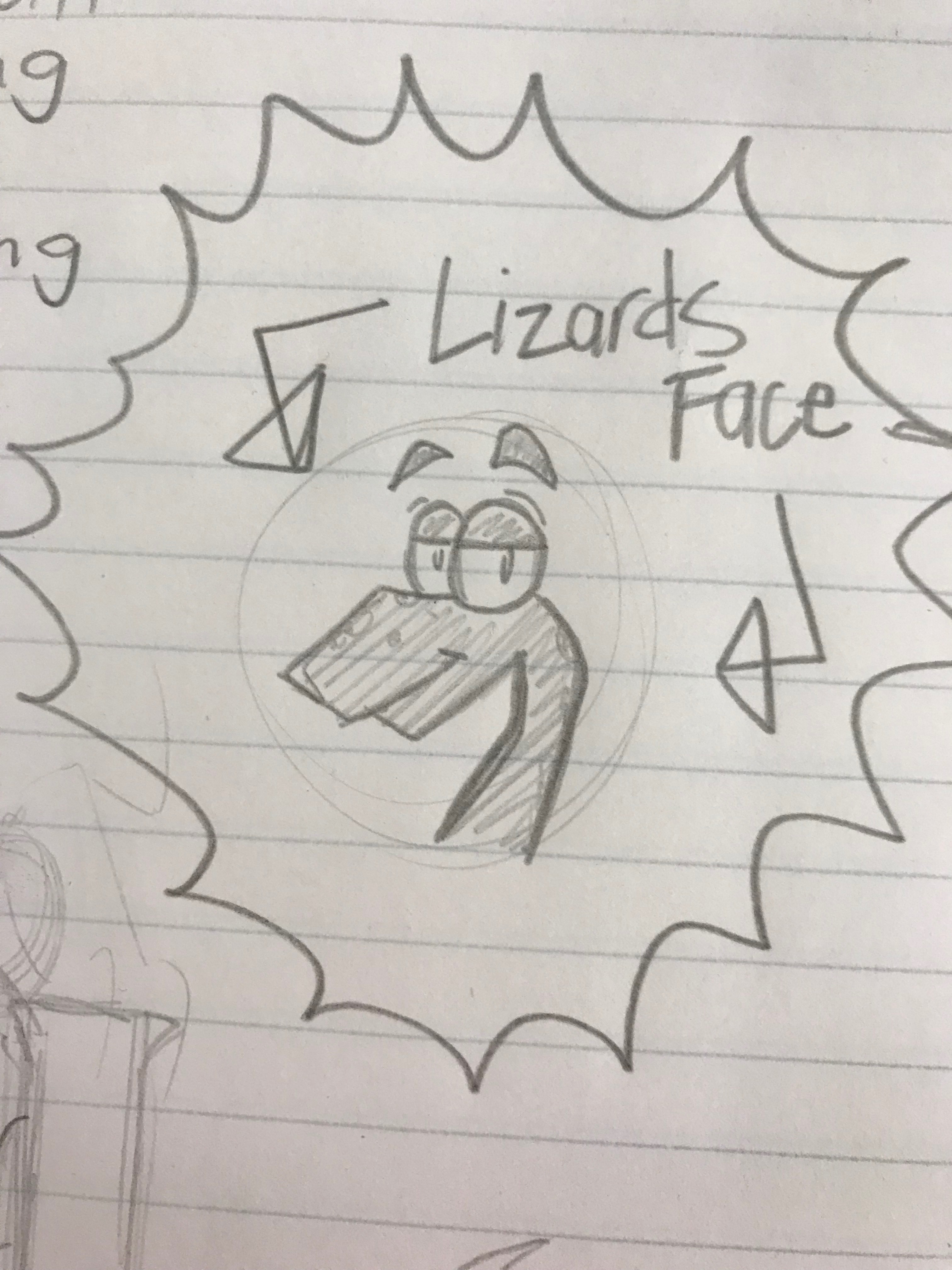
My last project in Illustrator was my Lizard Logo. It took many sketches and ideas to come up with a style, design, and layout that my peers and I could agree on.
My sketches started out with my name as the focus. I thought that if I was going to be making a logo for my own personal work, it should include my name. As i kept drawing, I decided to change that focal point to one of my many hobbies, art. Inserting a paint brush into my sketches changed the layout entirely, but after working on it for a while I noted that it was significantly tidier. I incorporated details I liked from all my sketches into my final idea.
Working on the actual logo in Illustrator was very different from working on the sketches, and it was challenging to get the colors the way I wanted. The only frustrating part to create was the legs, because every time I looked at them, they seemed uneven. After thinking I had fixed the problem, I would look back to see the same unevenness from before. It took a lot of revising to finally get the look I wanted.
I am satisfied with how my logo turned out; It expresses my nickname, “Lizard,” quite well. It shows my style, character, and personality all through my cute cartoon lizard logo.
For about a week I worked on building my own self portrait in Adobe Illustrator, using nothing but the pen tool. There were some easy and fun parts of the work I did that were fast-paced and simple. There were also some more frustrating pieces, such as the hair and mouth.
Some of the more easy objects to complete were the eyes, nose, and other facial shadows. Since I have already dabbled in cartoon pencil sketches and digital art, I know how much shadow and highlight incorporates into making a great drawing. I enjoyed figuring out how to use shadows to form my nose, instead of using defined lines. I also learned how to use the gradient tool to help with the shadow of my necklace, which made things a lot easier and more consistent.
The hardest part of this project to furnish was my hair. Pen tool malfunctions were common for a beginner such as myself, but I was able to fix any complications that came my way. I enjoyed adding more detail towards the top part of my hair, because of the dramatic color changes and the swoop of the hair going left. The consistency of the colors I chose to incorporate was a great addition to the neatness of it all. My lips were also a bit challenging, and I had to try many different tactics until I figured out what worked the best. Layers were my best friend during this assignment; I used many, many layers.
After completing this assignment, I definitely found something new that I would love to try more of at home and at school. It was easier than I thought it would be, and very rewarding when finished. I know there are still a lot of things I need to work on to make my next Illustrator project to be even better, but instead of being discouraged, I am very excited to start working again.
this blog post, I am using reverse-engineering to find good typography methods in a well-known advertisement. This TWIX advertisement I found caught my eye immediately. I noticed that the type face for the words “Left Twix” and “Right Twix” are decorative, because it’s not sans serif, slab serif, modern, or oldstyle. Sans serif means that that type of font does not have any slants in it. The items in the black circles above are the tips of the advertisement’s sans serif font. The font is simple because the letters don’t have any “slants.” The arrow on the Left Twix side is pointing to the font in the banner, and the smaller font below. They use the same font for all the words except the large left and right twix, to create consistency. Overall, I think the designers who created this advertisement knew how to correctly use typography to make it look more professional and pleasing to the eye.